It’s true that most of our email boxes are overflowing. We can’t keep up. Email marketing is becoming increasingly noisy, which is why we need to make sure we’re marketing across multiple channels to get maximum exposure to our target buyer.
That being said, there’s an interesting correlation we see across all the clients we work with: more email marketing equals more visits to the website. Even with all the noise, email marketing – when done correctly - is still a key strategy for engaging potential customers.
Good email marketing helps companies:
- Build credibility and trust with their target audience
- Increase brand recognition
- Drive interested buyers to the website
- Move prospects along the buyer journey
- Get more sales appointments
- Reduce client churn
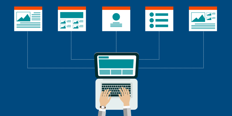
The most important thing to remember is that bad emails will drive prospects away, but good emails will keep prospects and customers engaged. I recently went through my favorite email newsletters and mocked up examples of how they are structured. Email layouts are continually evolving in both design and purpose to meet user demands.
Newsletter Design Best Practices
- Legible font size and color: The email must be easy to see and read. If the eyes have to physically strain to read the copy, you’ll turn off readers in a heartbeat. This sound simple, but the font and colors you like might make it harder for readers to absorb the information you’re trying to convey because it’s too light, too small, or too blurry.
- Consistent image sizes and character count: Humans are highly attuned and attracted to symmetry. Using consistent image sizes and character counts per section captures the reader’s visual attention and makes it easier for them to absorb the information. Asymmetrical emails look messy and confusing.
- Write to the design: To achieve symmetry, you need to write to the design vs. design to the writing. Once you decide on your template, the writer needs to stick within those parameters or your design goes completely out the window.
- Call-to-Actions: All emails should link the reader to the website or other important resources. Some templates hyperlink titles; others use actual call-to-action buttons. Either way is fine as long as you’re consistent!
- Intro: Writing a personal intro at the beginning of your email is an option, but there’s no hard and fast rule about it. It depends on the relationship you have with your audience or if you have anything of value to say. For example, something like, “How are you today?” is just wasting readers’ time.
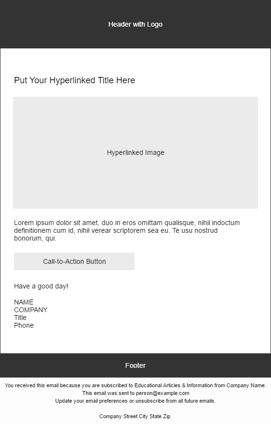
- Signature: This is another option that some newsletters have, and some don’t. If you decide to use one, the most important thing is not to duplicate information that’s already in your newsletter. For example, if your company address is in the footer, don’t put it in your signature. The shorter the better!
- Mobile friendly: This is vital, but often overlooked. Make sure your email looks good on various devices. Watch the way the text wraps around the images on different size screens – sometimes the email can look awesome on one size screen, and horrible on another. Take the time to do some testing.
Newsletter Examples
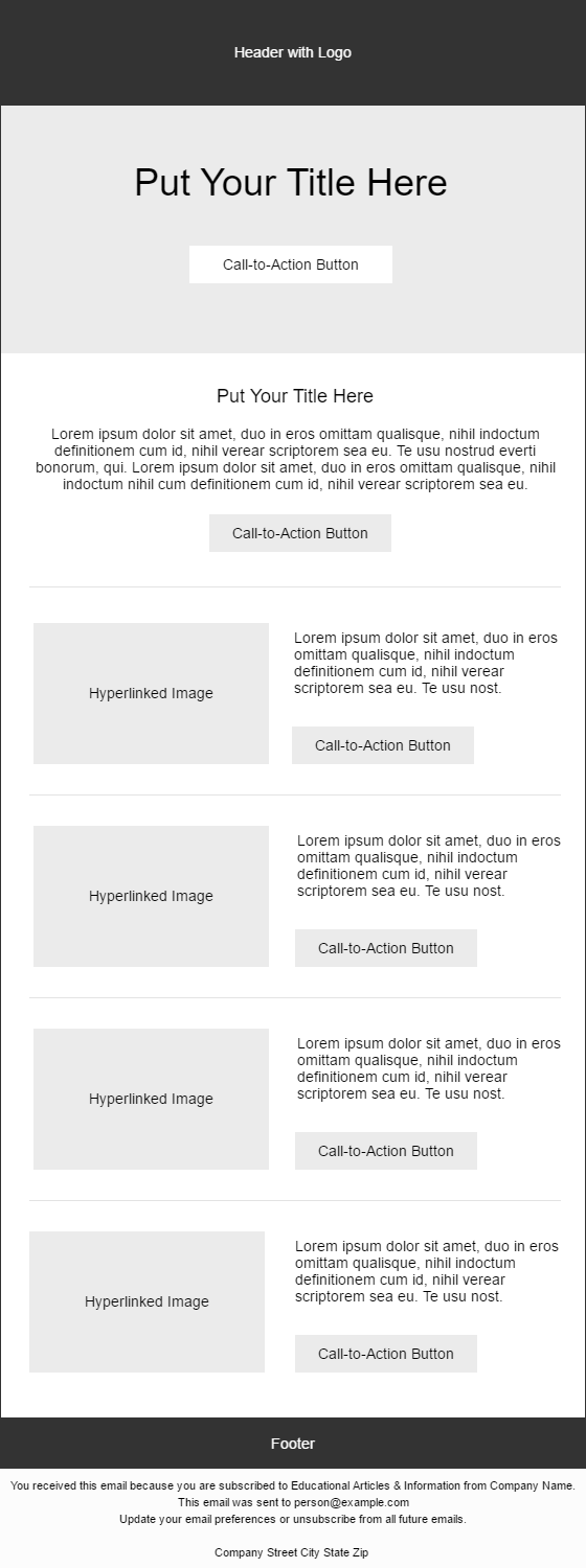
Dedicated Promo Newsletters
Dedicated promos are emails that only promote one thing, such as a blog post, landing page, event, or product special. This type of newsletter gets more visits to the desired page because there is only one option for the reader to choose. Keeping it short and straight-to-the-point (100 words or less) simplifies the user experience and makes it easier for the reader to take action.
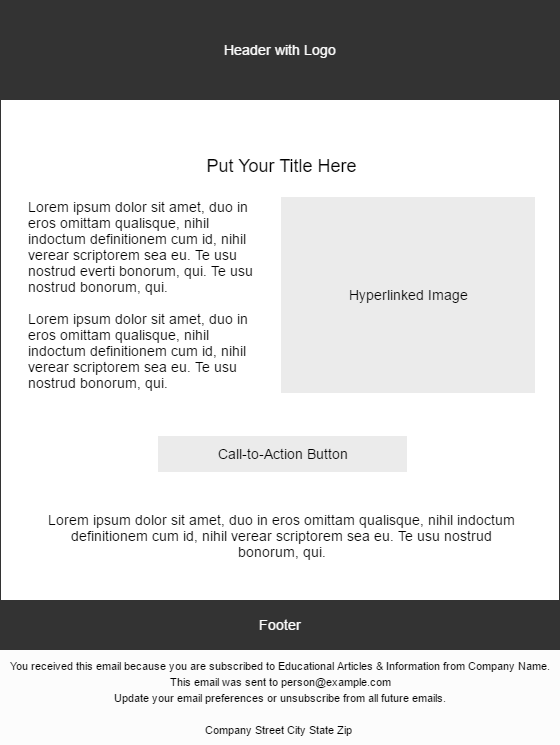
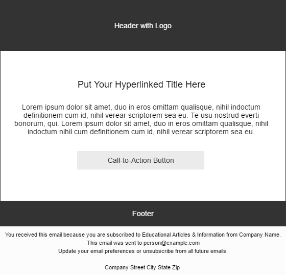
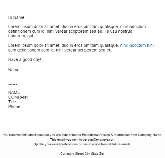
If your email is coming from a person vs. a company, you can try something even more simple; using an unbranded, plain text email to make it more personal.
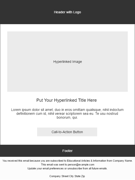
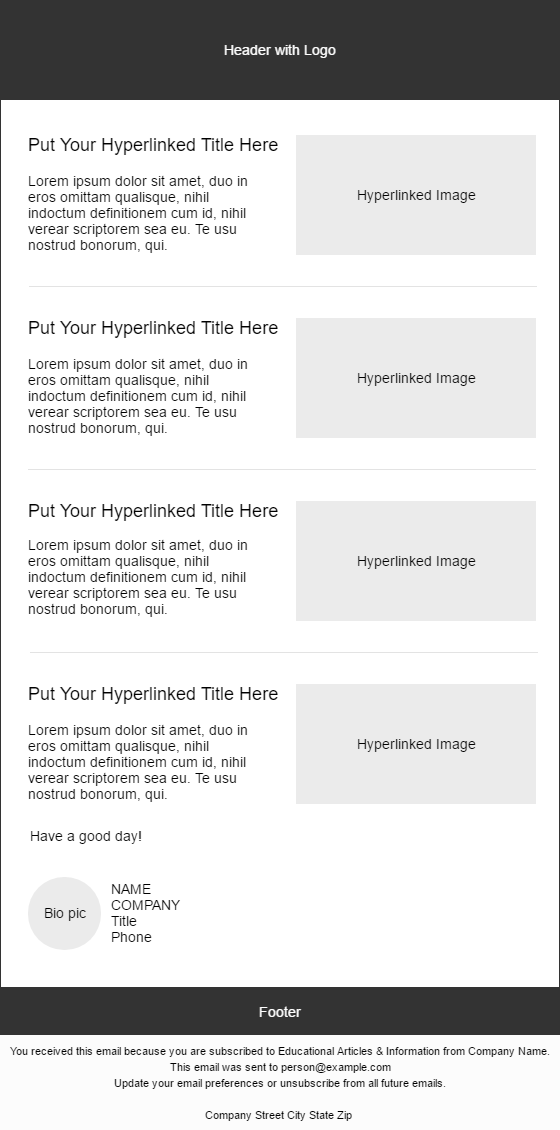
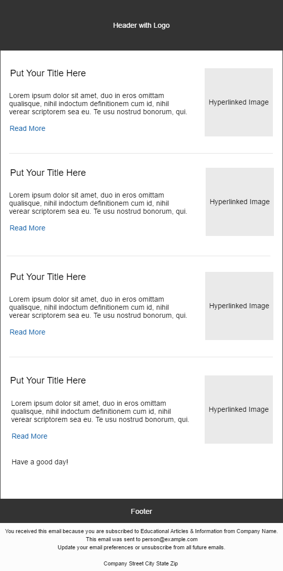
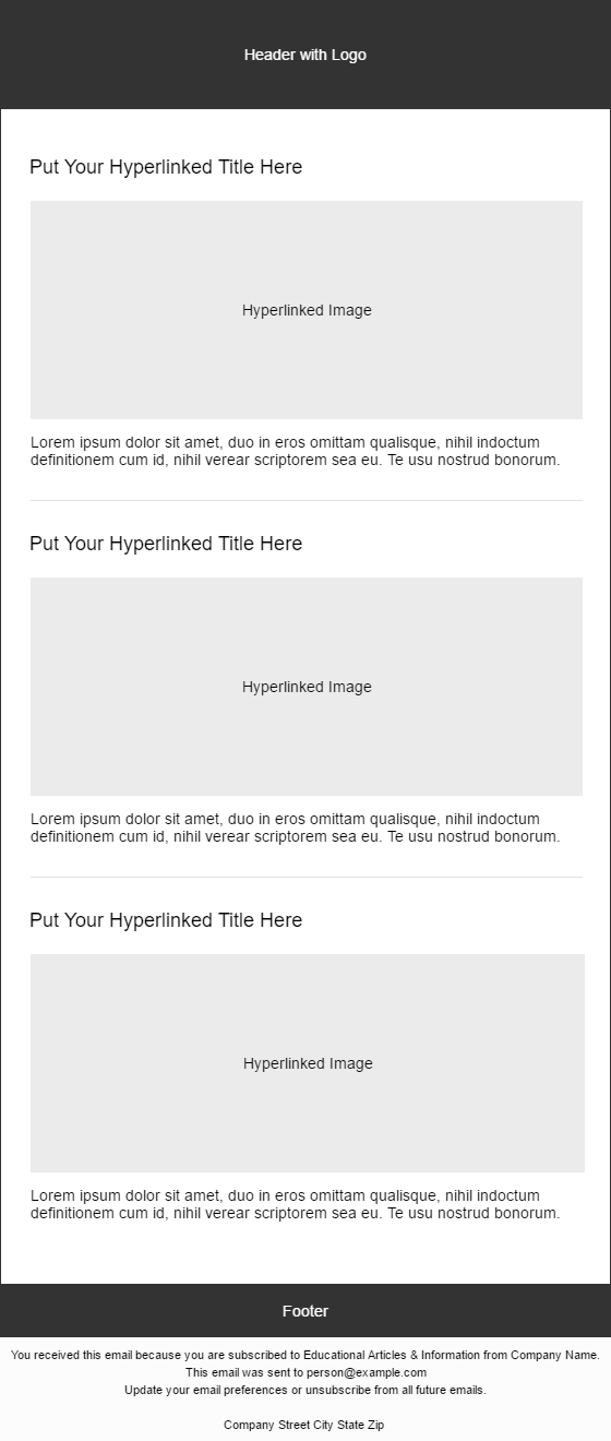
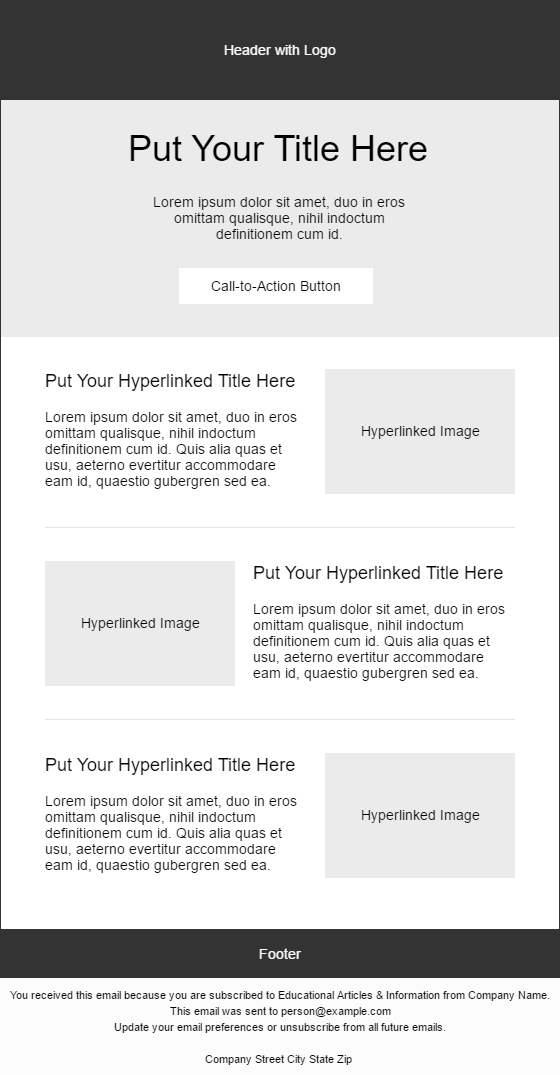
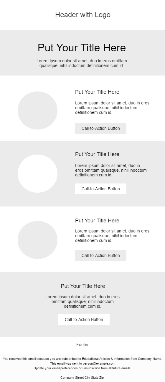
Digest Newsletters
Digest emails are used to share a variety of things with your audience all at once, such as most popular blogs, upcoming events, or other marketing campaigns. The length may vary, but the key to success is simple and scannable. Make it as easy as possible for the reader to absorb your information. I know I already said that, but it bears repeating. A cluttery, confusing email with a million links will confuse people.
The differences between the various styles revolve around image sizes, image placement, call-to-action buttons vs. text links, call-out areas for a special promo, or sections vs. no sections.
Conclusion & Additional Resources
Think about the type of content you want to promote and which format would work the best. Stick with it for a while and test your response rate before trying something new. You don’t want to have a different looking email every single time. You want your audience to get familiar with your style.
For more information about email newsletters, check out these resources:
Comments